Good logos are eye-catching and memorable. Really good logos are eye-catching, memorable and clever. In a country where the symbols of language are much like logos themselves, pictorial signifiers of meaning, we can expect some pretty top-notch stuff. But is that always the case? Let’s unpick some of China’s most lucrative logos as well as a few that don’t quite make the mark.
Bank of China
Bank of China has its logo down to a tee, shaped like an ancient Chinese coin, the kind that once had a hole in the centre so people could carry around and store their riches on a string. Take a closer look and the shape in the centre is the character “櫓” (“zhong”), meaning “centre” (“櫓벌”; China or “central country”). It’s seems Bank of China isn’t the only bank to cash in on this nifty design; the ICBC logo uses exactly the same concept.
Nongfu Spring Water
You may not be surprised that the logo of this household drinking water brand depicts mountains, a couple of birds and, well, water. In fact, it’s an image of Thousand-Island Lake in Zhejiang from where the water is sourced. Ironically, that which is now a vast water source was once a hilly outcrop home to some quarter of a million people, which was subsequently flooded in the making of a nearby dam. Had it not been for the dam, what might their logo look like?
Nanjing Arts University
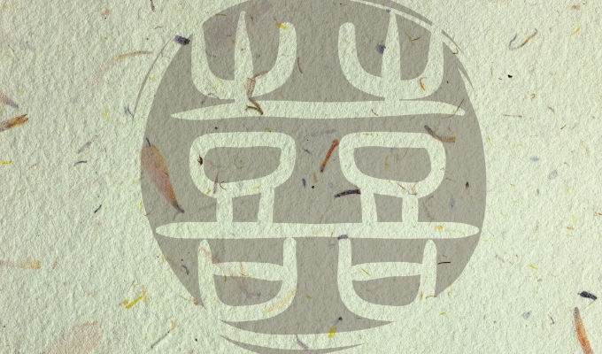
It only makes sense that Nanjing’s thriving art school has a slick and well-designed logo. Shaped like a painter’s seal, it combines the two characters “켓” (“nan”; south), referring to Nanjing, and “論” (“yi”; arts), together ,which make up the university’s abbreviated name, “Nanyi”. The amalgamated character is also shaped like the original gate of the university from its founding in 1912 which still stands at the entrance to the campus today.
Did Chuxing
A spot of rebranding was called for in 2015 to shake off Didi’s bad reputation as an illegal taxi service, leading to the current logo, which is shaped like an orange “D” on its side with a small chunk out the corner. Apparently also the shape of a smiling grin, the semicircle originates in earlier logos of smiling orange cars. And just to hone in on that image, Didi found obliging celebrities, both male and female, to smile for the camera in the most vulgar orange lipstick as part of the rebranding campaign.
Haier
Up there with the worst logos ever has to be Haier’s, so much so that even Haier itself is working hard to phase it out. If you can’t see one right now on a nearby fridge or air con, then let me remind you that the logo is a pair of young boys in Speedos, hugging. Apparently they represent the brotherhood between Haier and its German joint-venture company Leibherr, which also gave rise to the company’s name. If memorable is how you rate logos, then you have to give it to Haier!

